Custom drawable states in Android
A state list drawable is a really useful Android resource for displaying different drawables for a view depending on the state of that view. e.g. we can define a state list drawable for the background of a button that defines a colour for both pressed and unpressed states. The button takes care of switching between the two drawables depending on the state.
You can make state list drawables even more useful by defining custom states.
This is a screenshot of a hypothetical email client, notice the difference between read and unread messages.
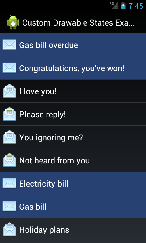
The recommended implementation for a screen like this would be to use a ListView. In this example, each item in the list is a RelativeLayout containing an ImageView and a TextView. When displaying each item you could manually switch between the two images used and set the background colour accordingly. However, by defining a custom state you can make it simpler and easier to maintain.
Step 1: declare the custom state attribute
The custom state is declared in the ‘attrs.xml’ file in the application’s ‘res/values’ directory.
<?xml version="1.0" encoding="utf-8"?>
<resources>
    <declare-styleable name="MessageState">
        <attr name="state_message_unread" format="boolean"/>
    </declare-styleable>
</resources>
Step 2: use the custom state in the state list drawables
In the message list example there are two state list drawables.
One for the list item background:
<?xml version="1.0" encoding="utf-8"?>
<selector xmlns:android="http://schemas.android.com/apk/res/android"
          xmlns:example="http://schemas.android.com/apk/res/com.charlesharley.example.android.customdrawablestates"
          >
    <!--
    We make the pressed and focused selector items transparent so the ListView's own selector states show through.
    -->
    <item android:state_pressed="true"
          android:drawable="@android:color/transparent"
          />
    <item android:state_focused="true"
          android:drawable="@android:color/transparent"
          />
    <item example:state_message_unread="true"
          android:drawable="@color/message_list_item_background_unread"
          />
</selector>
And one for the message status icon:
<?xml version="1.0" encoding="utf-8"?>
<selector xmlns:android="http://schemas.android.com/apk/res/android"
          xmlns:example="http://schemas.android.com/apk/res/com.charlesharley.example.android.customdrawablestates"
          android:constantSize="true"
          >
    <item example:state_message_unread="true"
          android:drawable="@drawable/message_read_status_unread"
          />
    <item android:drawable="@drawable/message_read_status_read" />
</selector>
To use the custom state all you need to do is declare a new XML namespace using your application’s package name and prefix the custom state attribute with the new namespace.
Step 3: update the view’s drawable state to include the custom state
Each view provides a number of existing states that can be used by its drawables where applicable, e.g. a CheckBox has a checked state. By overriding View.onCreateDrawableState() a custom view can inject its own states, which are then made available to the view’s drawables.
In the message list example, the relative layout that contains the image view and the text view is a custom implementation that maintains an unread state, which when set, updates the view’s drawable states resulting in the different look for read and unread messages.
public class MessageListItemView extends RelativeLayout {

    private static final int[] STATE_MESSAGE_UNREAD = {R.attr.state_message_unread};

    private boolean messageUnread;

    // Constructors, view loading etc...
    @Override
    protected int[] onCreateDrawableState(int extraSpace) {
        // If the message is unread then we merge our custom message unread state into
        // the existing drawable state before returning it.
        if (messageUnread) {
            // We are going to add 1 extra state.
            final int[] drawableState = super.onCreateDrawableState(extraSpace + 1);

            mergeDrawableStates(drawableState, STATE_MESSAGE_UNREAD);
            return drawableState;
        } else {
            return super.onCreateDrawableState(extraSpace);
        }
    }

    public void setMessageUnread(boolean messageUnread) {
        if (this.messageUnread != messageUnread) {
            this.messageUnread = messageUnread;

            // Refresh the drawable state so that it includes the message unread
            // state if required.
            refreshDrawableState();
        }
    }

}
What about the message status image view? Good question! Because the image view is a child of our custom view we tell it to duplicate its parent state using View.setDuplicateParentStateEnabled(). Any state in the parent is passed down to the children including custom states. Brilliant!